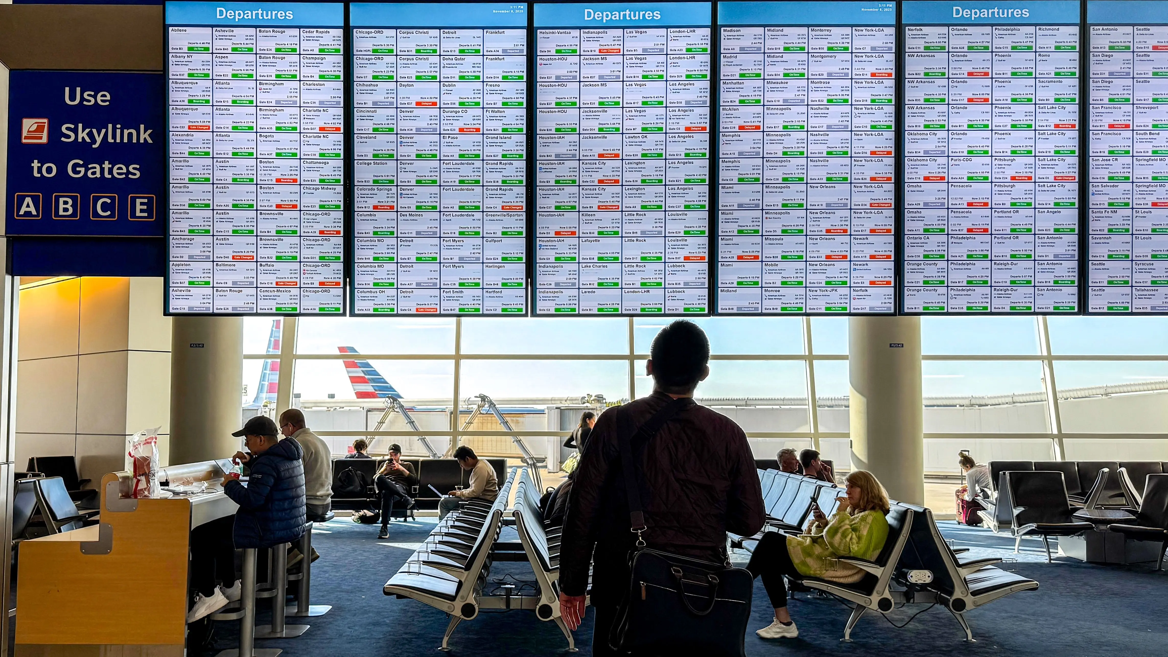
DFW Airport Introduces New Flight Display Screens Causing Traveler Confusion
Karla Demery, a travel journalist observing the rollout, reported that even
Dallas/Fort Worth International Airport has rolled out updated digital display screens across its terminals, but the new system is leaving many passengers struggling to locate essential flight information. Installed in early September 2026, the screens were intended to modernize the airport’s information delivery, yet early reports indicate they are having the opposite effect on usability. Travelers, including frequent flyers, are spending more time searching for gate numbers and departure times, leading to increased congestion near display areas. The confusion stems from a redesign that altered the layout and presentation of flight data. Instead of the traditional linear format familiar to passengers, the new screens use a clustered, tile-based arrangement that groups flights by airline or destination in a less intuitive manner. Critics note that font sizes vary inconsistently, and key details like boarding status are not immediately visible.
Latest news
 Exploring the Untamed Beauty of Northern Louisiana
 Beyond the Capital: British Tourism Chiefs Target Indian Visitors
 19 Unique Things to Do in Cape May, NJ
 A Local Says to Visit These 29 Farms in Puerto Rico
Karla Demery, a travel journalist observing the rollout, reported that even seasoned travelers appeared frustrated, often needing to check multiple screens or ask staff for assistance. Airport officials have acknowledged feedback but have not yet announced plans to revert or modify the current interface. Why the New Design Is Disorienting Passengers The shift to a visual tile layout was meant to highlight promotional content and improve aesthetic appeal, but it compromises the speed and clarity travelers rely on during tight connections. Unlike the previous system, which prioritized chronological order and uniform formatting, the new screens require users to scan across multiple zones to find their flight. This design choice increases cognitive load, particularly in high-stress environments. Accessibility advocates have also raised concerns, pointing out that the reduced contrast and smaller text in certain sections may hinder visibility for older adults or those with visual impairments.
One passenger described the experience as „like trying to read a subway map during rush hour.” Can Travelers Adapt Quickly Enough to Avoid Delays? While some passengers may eventually grow accustomed to the new format, the transition period poses real risks for missed flights and heightened anxiety. Airport staff have reported a noticeable uptick in inquiries at information desks since the screens went live, suggesting that reliance on human assistance is increasing—a costly and inefficient workaround. Experts in human-computer interaction argue that usability testing should have been prioritized before full deployment, especially in a hub serving over 70 million annual passengers. Without adjustments, the airport could see cascading delays as travelers linger longer at displays, obstructing walkways and slowing overall terminal flow. Frequently Asked Questions Why did DFW Airport change its flight display screens?
Content written by Marco Ricci for travel-good.com editorial team, AI-assisted.